pti :: moments inked :: color coordinating with paint swatches and tassels
Are you like me? Do you have more paint swatches and skeins of embroidery floss than you know what to do with? There's something about their deeply saturated colors that makes me covet and hoard them both. And when I started using them in my Moments Inked Memory Planner, coordinating them with Papertrey Ink's own spectrum of brilliant hues, I became more hooked than ever! If you share these tendencies, you'll want to read on and see how I've put my overgrown collection to good use.

One of my most favorite things about the MI planner is the color within the pages. The daily pages, in particular, are so pretty to look at that I almost hate to ruin them by adding my handwriting! But I've come up with a way to quickly enhance my pages, while making more room to add notes and using up my stack of paint swatches and floss.

Fellow creatives have been using paint chips for years and they come up with the best uses for them. It's really no surprise that list-makers and planners have also adopted these practices. What I've done today is nothing new and I'm not trying to claim it as my own, but I will show you a couple of ideas for using them with your MI system.

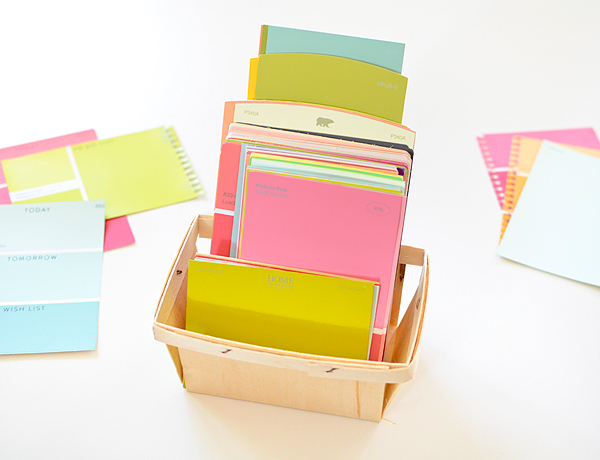
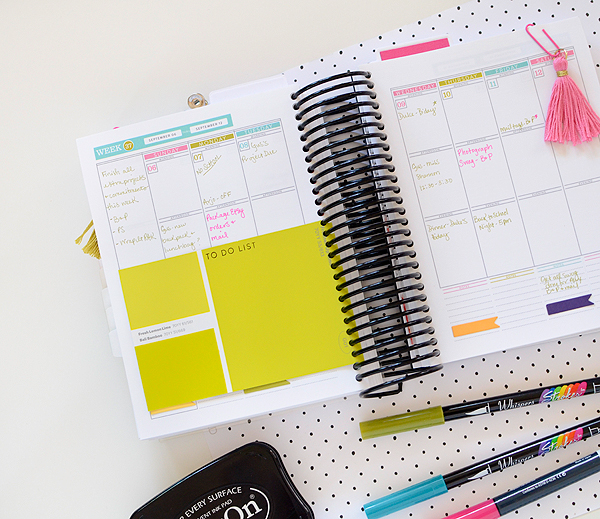
I started by utilizing the ombre cards. The reason I like them is because they're divided and I'm a person who needs to think and plan ahead a little bit when I'm looking at my day-to-day or week-to-week plans. I stamped TODAY, TOMORROW, and WISH LIST from the Listed stamp set in the different color boxes and it's enough room for me to jot down a couple of notes. On my wish list are the things I hope to accomplish if today and tomorrow's tasks are somehow miraculously completed--I'm sure you know how that goes!

I can then either just tuck the list into my planner and call it good or I can use the Basic Pages dies to cut tabbed holes in them so they can be inserted in the book. I like having the option to do both; by inserting it into the book, it doesn't become just another random flyaway piece of paper.

I also created similar lists for the month and week-at-a-glance pages. Paint swatches come in multiple layouts, shapes, and sizes so you can choose your preference. For the at-a-glance pages, I chose to use these Glidden chips from Home Depot. I used a landscape layout and cut the holes in the larger square. (Tip: In order to avoid trimming the card down to a small size when die cutting, I used the largest page die. For the other lists, which are Olympic brand from Lowe's, I used the third largest and it was nearly a perfect match! You can also use the Edged Die which will work just as well, if not better!)

For these, I used the TO DO LIST stamp, also from the Listed stamp set. The paint chips have a smooth surface so I used Stazon Jet Black ink for a solid finish that wouldn't smudge. And for writing, I used a ballpoint pen. I've tried gel pens, Sharpies, and other markers, but they don't adhere well to the surface.
After I was finished with my paint card inserts, I turned to tassel-making with my embroidery floss. Tassels, I'm sure you have noticed, are everywhere in the planning community. Because I recently spent a solid week stitching up PTI felt for my last Quick Stitch Kit projects, my floss has been sitting out on my desk in it's array of gorgeous PTI colors. I had to use it in my planner, too!

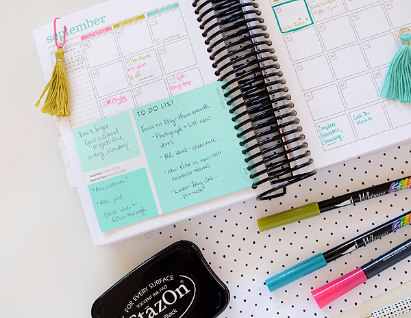
I mean, those colors...The skeins of floss were pretty enough sitting out on my desk, but this little basket of tassels is not going anywhere anytime soon. It's inspiring and so cheerful to look at...I made tassels to coordinate with 3 different months in the planner--August, September, and October--and the colors are heavenly.

I'll provide a list of the shades I used at the end of this post, but it's really easy to take your card stock or felt to the craft store and match them that way (that's what I did for the paint samples, too). These are just small tassels and I hooked them to small pink paperclips and attached them to my pages. The clips are from the Target One Spot and just happen to be a perfect color match to Hibiscus Burst! Bonus!

You don't have to worry too much about choosing colors that go well together because PTI has done that for you each month. All you need to do is find a few accessories that match--or come close to it--and with paint cards and embroidery floss, you are certain to find a wide array of saturated hues to compliment your planner.

Happy planning!
Papertrey Ink Supplies:
Embroidery Numbers (for tassels shown in photos): (All floss DMC)
Simply Chartreuse - 734
Canyon Clay - 922
Berry Sorbet - 3705
Hibiscus Burst -3806
Hawaiian Shores - 959
Aqua Mist - 964
Summer Sunrise - 742
Paint Swatches from the following stores:
Home Depot
Lowe's
Walmart
Also used:
Stazon Jet Black Ink
what a great way to recycle! I love those paint swatches! and the tassels!
ReplyDeleteVery fun!!! I'm always bringing home paint samples (we are looking at painting our entire house...some day!) - this would be such a fun way to use them!
ReplyDeleteOk this is so much fun-I just love this!! I'll definitely be doing this! Thanks so much for sharing all your fun ideas :)
ReplyDeleteLove the tassels! Using jump rings is such a great idea! Did you also use one to secure the floss to the ring? Looks too neat to be just be tied...share the secret!! Great swatch idea I'll be sure to try it out!!
ReplyDeleteSo pretty, love all the colors!
ReplyDeleteYou inspire me SO much. Totally following by email now. :) You have a REALLY good eye for detail, design, and color. #bigfan
ReplyDelete