gossamer blue :: july :: pink and gold packaging
You may have seen this last month on the Gossamer Blue blog, but in case you didn't, I'm re-posting it here. I hope I never outgrow pink & gold...
July's kits were full of bright, happy colors that are so perfect for summer. While I loved working with the full spectrum of rainbow hues on my other projects, I just couldn't resist my favorite color palette of blush pink, gold, and a bit of black.
The first thing I see when going through the monthly kits is the big picture. That means my brain is focusing on all of that color and automatically wants to take the products and produce something like this...

I love projects like these mini cards (they photograph so well, for one!), but they are a bit of a departure for me, as I tend to gravitate toward softer colors, for some reason. It's always good to step outside your comfort zone and challenge yourself, but admittedly, it was a sweet moment when I was able to break down the kit pieces and isolate the blush pink and gold in the midst of all the bold, primary-esque tones.

Hiding amongst the reds, oranges, and blues this month were the slightest bits of pale pink--stickers from Shimelle and vellum circles, both in the Main Kit. I adore pink and gold as a soft, sweet palette (I hope it's not passé yet), but I also love what happens when you add black to the mix; it's like going from the bridal shower tea to the bachelorette party!

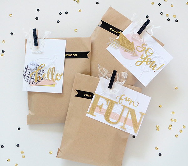
Another thing I'm excited about is that the Life Pages cards now come in these kraft bags because I can always find a way to incorporate them into packaging.

'Happy Hello' was the first card I made and it started when I put a pink sticker over the 'Today's Top Story' card from LP Kit #3. There is a smidge of the spring green showing and a thin black line, both of which I liked for their classic design elements. Initially, these tags were going in an entirely different direction, but as I got into the project and began putting the phrases together, I let the cards and color palette define themselves.


The 'Hello' card went in the direction of layered, trendy, almost geometric, but the ideas and aspects I was trying on the other two cards for that same look weren't working. I was sure I wanted to keep black as a component, though, so I had to find a way to incorporate it elsewhere. The first thing I did was use black glitter clothespins to secure the tags to each bag. They looked pretty bare, so I tried black twine, black ribbon, and a couple of black and white washi tapes from my stash, none of which I was happy with.

Then I remembered the black and gold labels by Seven Paper and they worked like a dream! They had the edge I wanted and I loved that they were a true black so they really pop against the white cards. They're sticky so they work just as well as tape, too. I chose fun phrases and snipped a V out of them, and the packaging was complete. Oh, and a little lace, of course.


The gold foil stickers (Main Kit), also from Seven Paper, were another facet I used on each card. The tags don't have to match exactly, but a few like elements gives the set a cohesive feel.

In the July kits, with their full spectrum of colors, I managed to come up with something entirely different (nearly color-less), so it just goes to show that if you look carefully, Gossamer Blue kits have you covered for any situation!

LOVE all the gorgeous eye candy!
ReplyDelete